Brand Identity — 2024
KMEDIA — Marketing | Branding
(02) Client
KMEDIA
About Client
KMEDIA is an advertising and social media agency that provides content, communication, and digital marketing solutions. As a Meta partner, the brand aims to appear modern, professional, technology-driven, and highly connected.
(03) Process
How it was made
Process
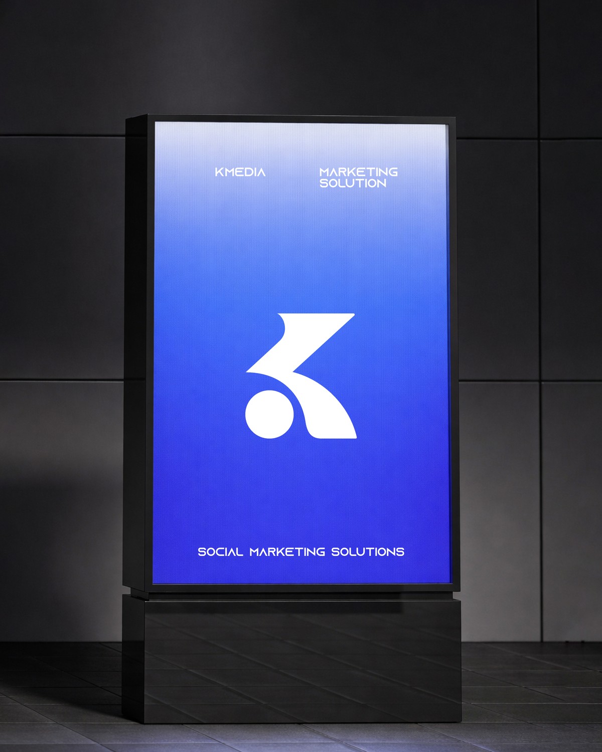
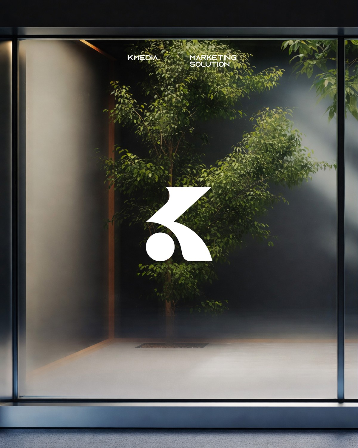
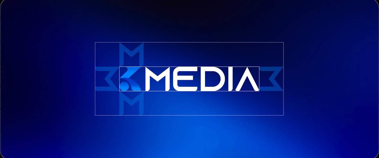
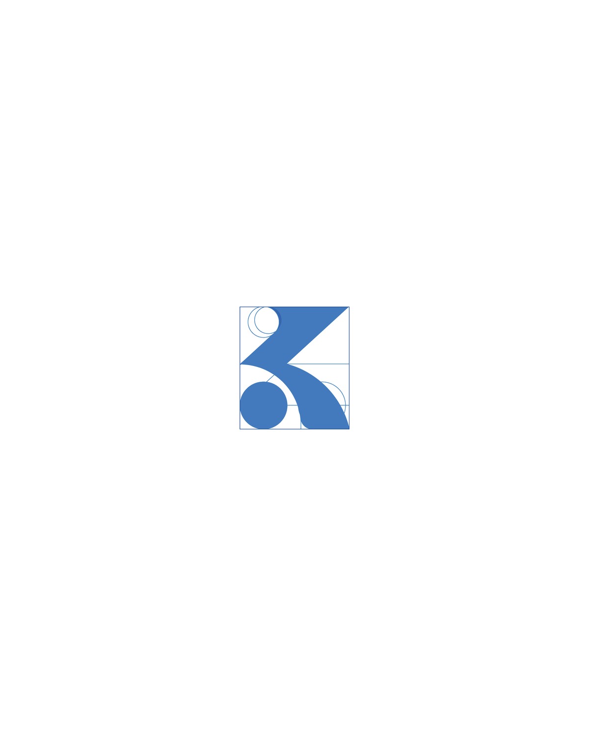
Logo: The logo combines the letter “K” with an upward growth chart, representing progress, development, and forward movement.
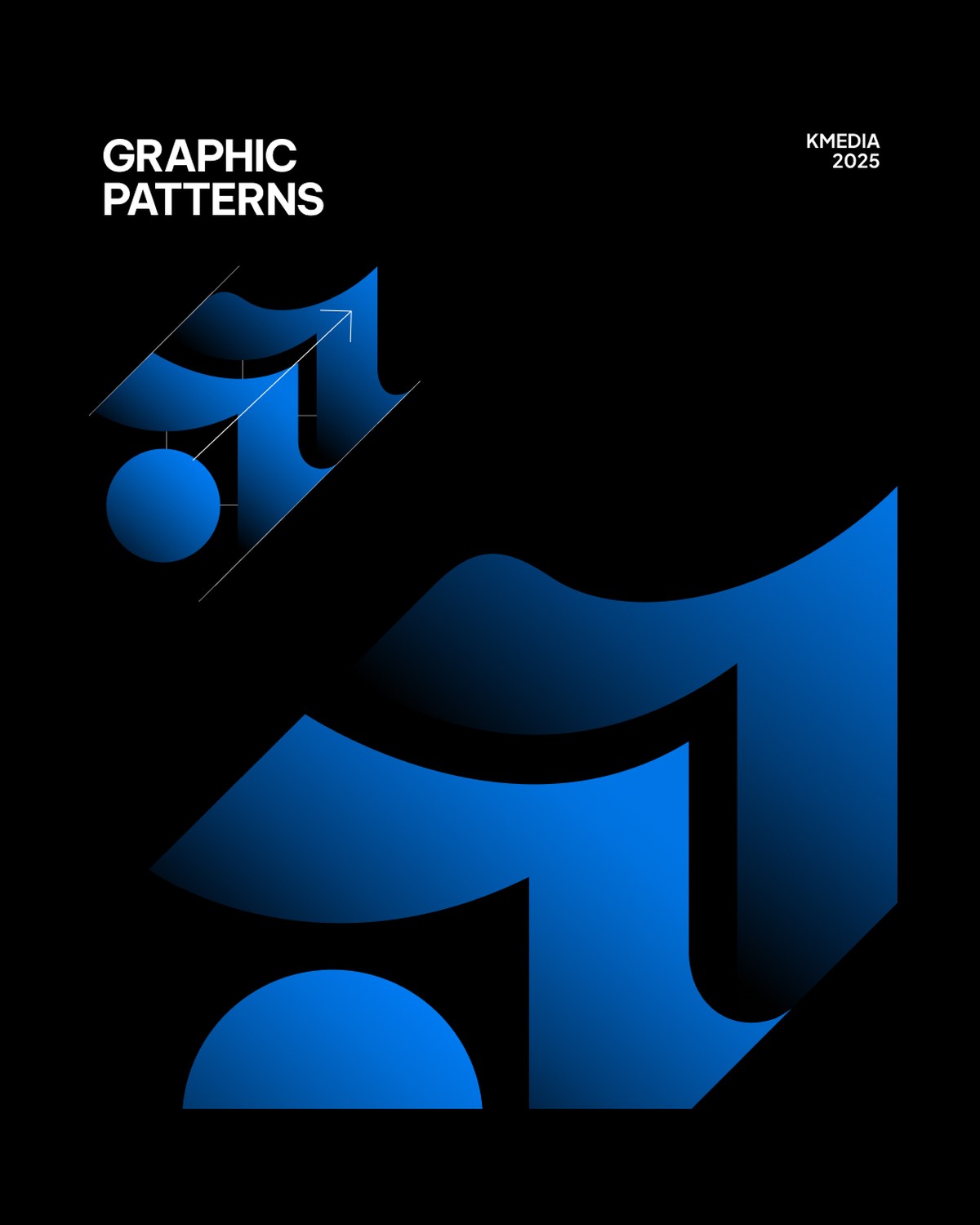
Patterns: Upward graphic shapes reinforce the idea of expansion and performance, while circular forms symbolize connection, community, and data.
Typography: Alexandria was used for headlines to create a bold and modern presence, while Inter was selected for body text to ensure clarity and readability.
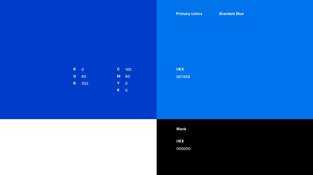
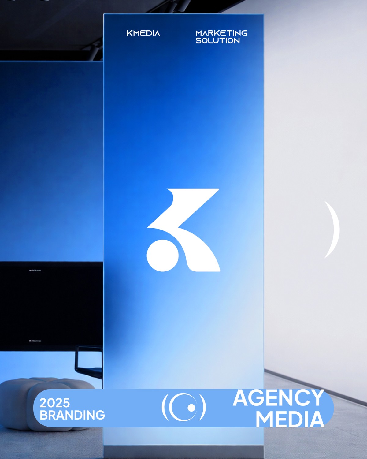
Color Palette: A blue gradient system was used to express trust, technology, energy, and modernity.
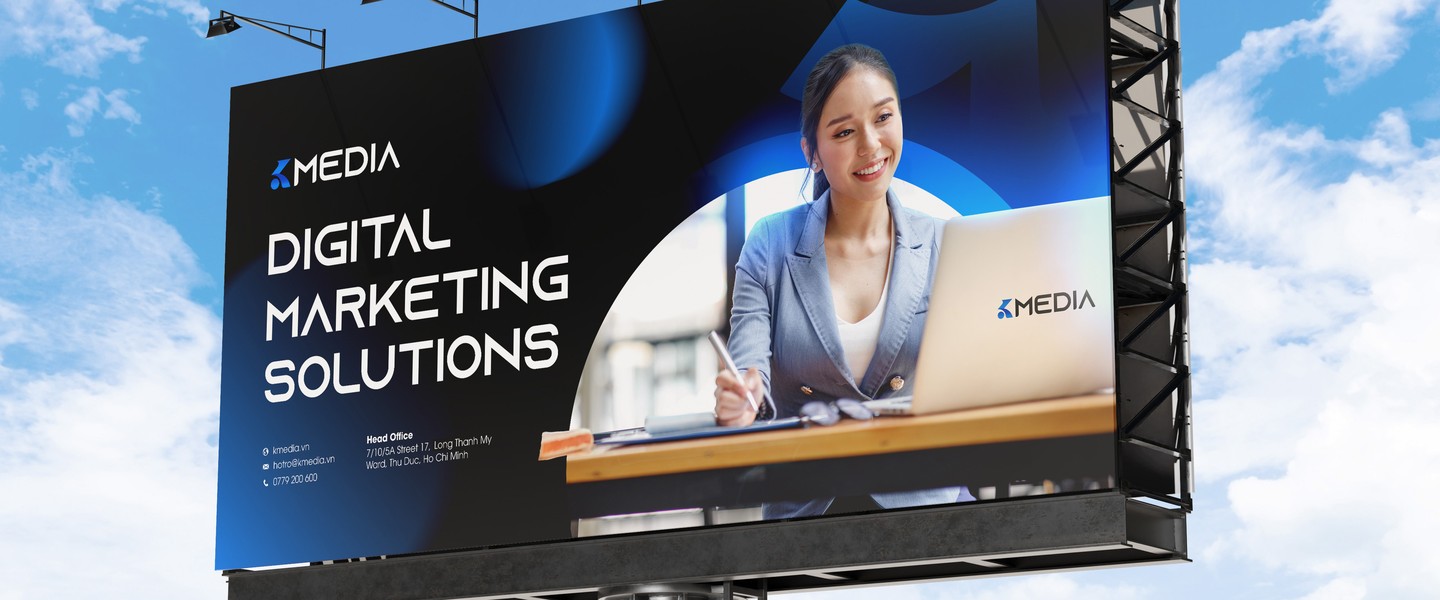
Imagery / Graphic Elements: Clean digital layouts, geometric forms, and graphic elements inspired by charts, arrows, and data visualization help reinforce the brand’s role in advertising and social media growth.

(04) Showcase
Brand Identity
Final Design