Brand Identity — 2025
Vietnexus — Logistics | Branding
(02) Client
Vietnexus
About Client
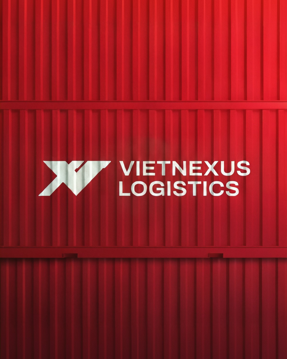
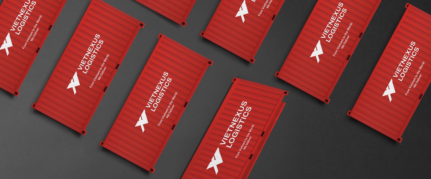
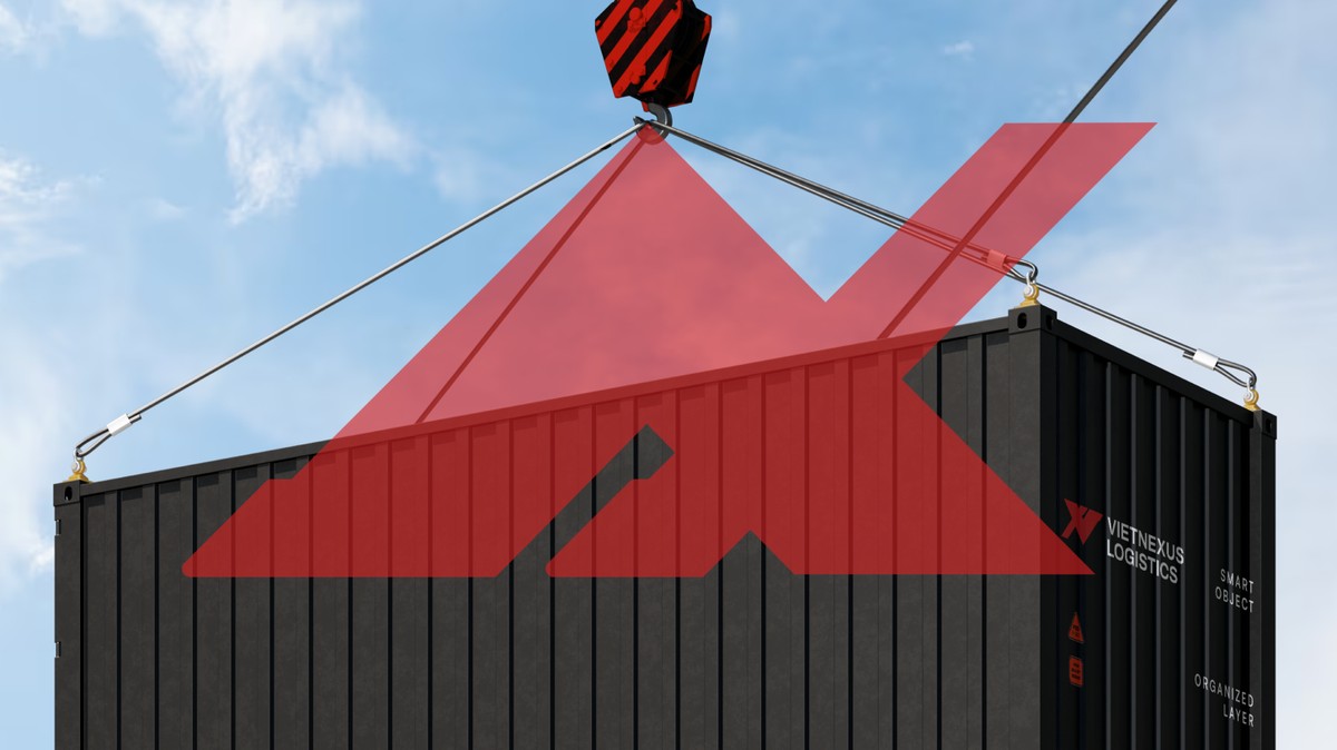
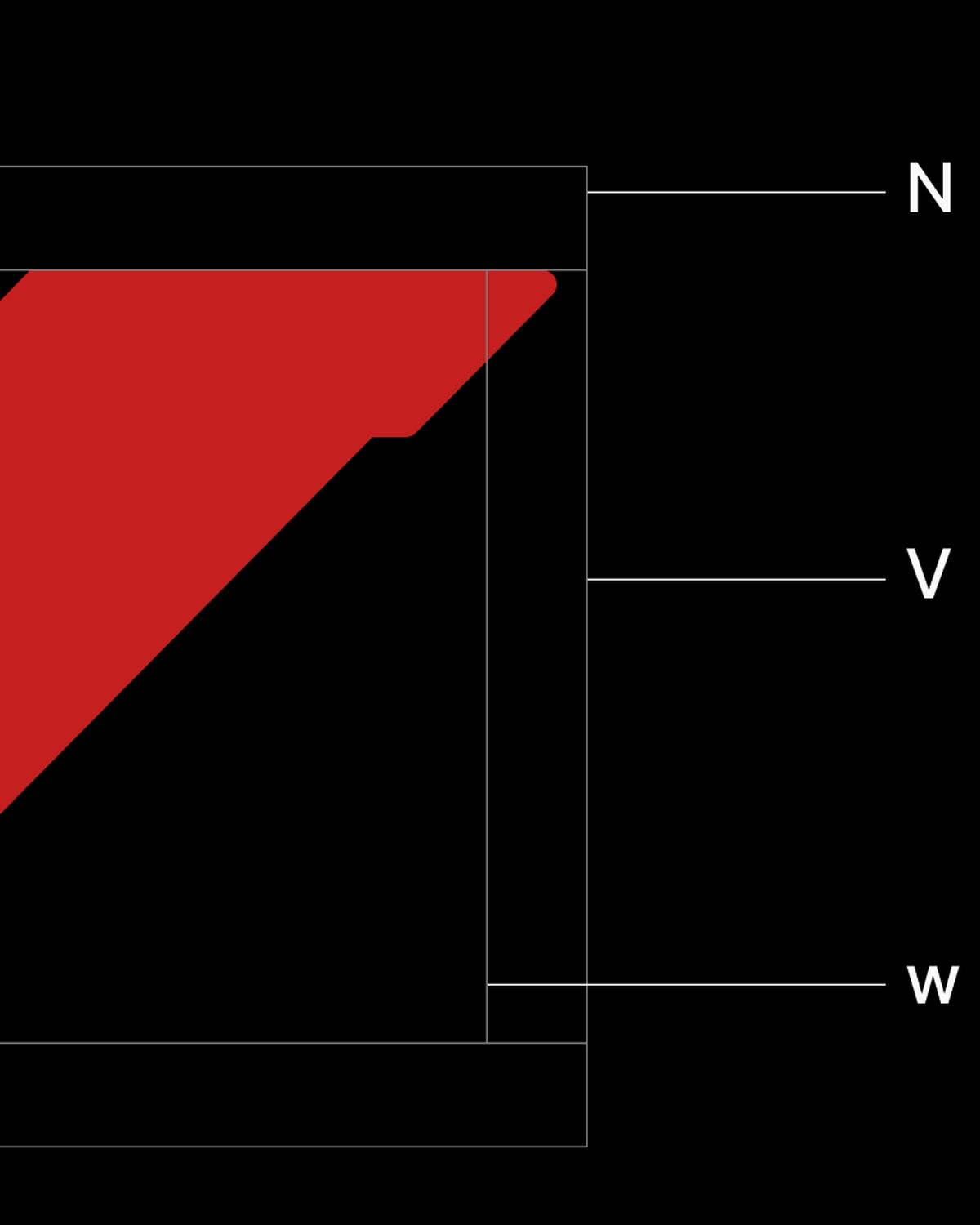
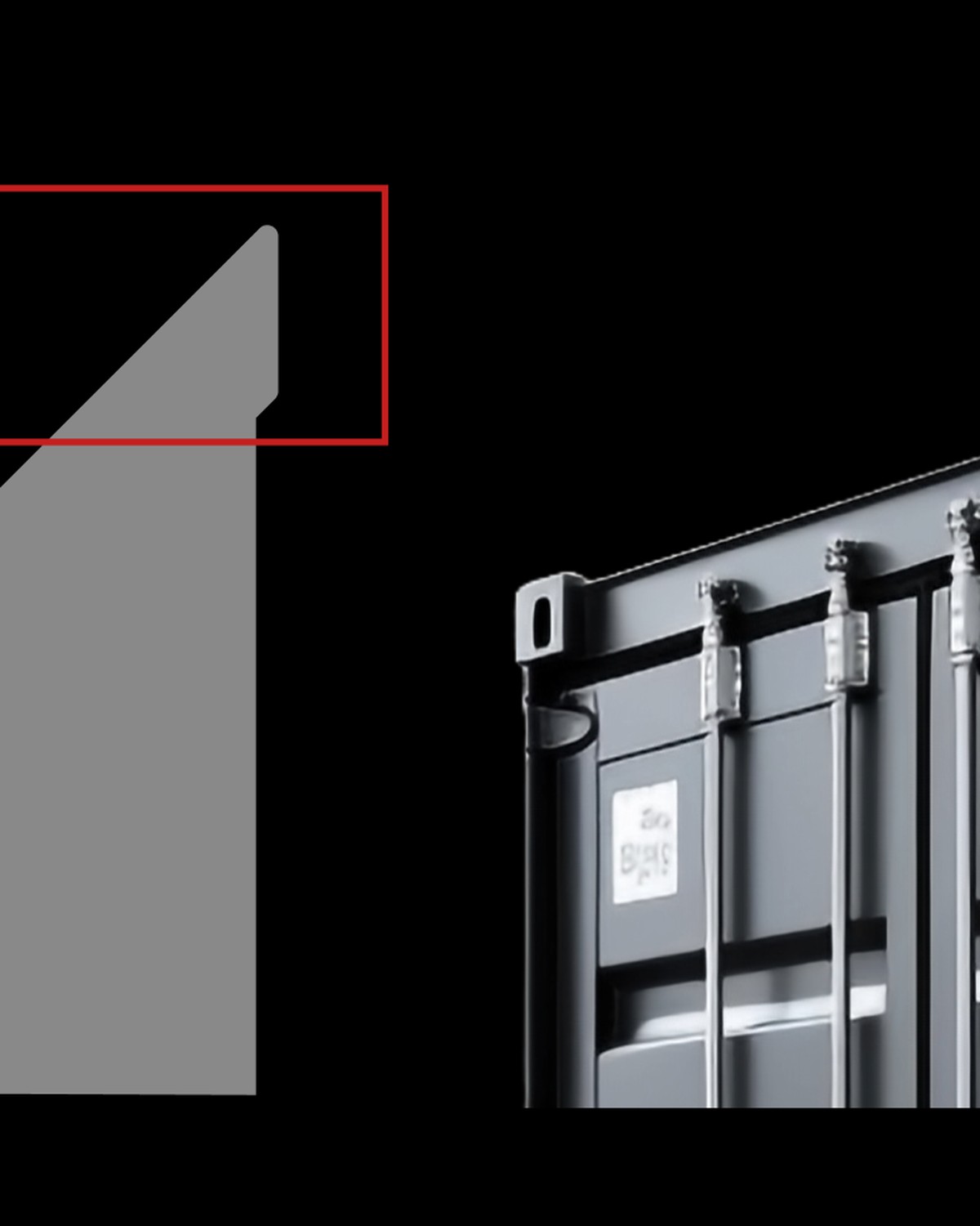
Vietnexus needed an identity that felt as dependable and far-reaching as the network it runs. Inspired by the corner casting of shipping containers, the mark integrates V + N + W (World) into a single geometric form — a signal of structure, movement and global reach.
(03) Process
How it was made
Process
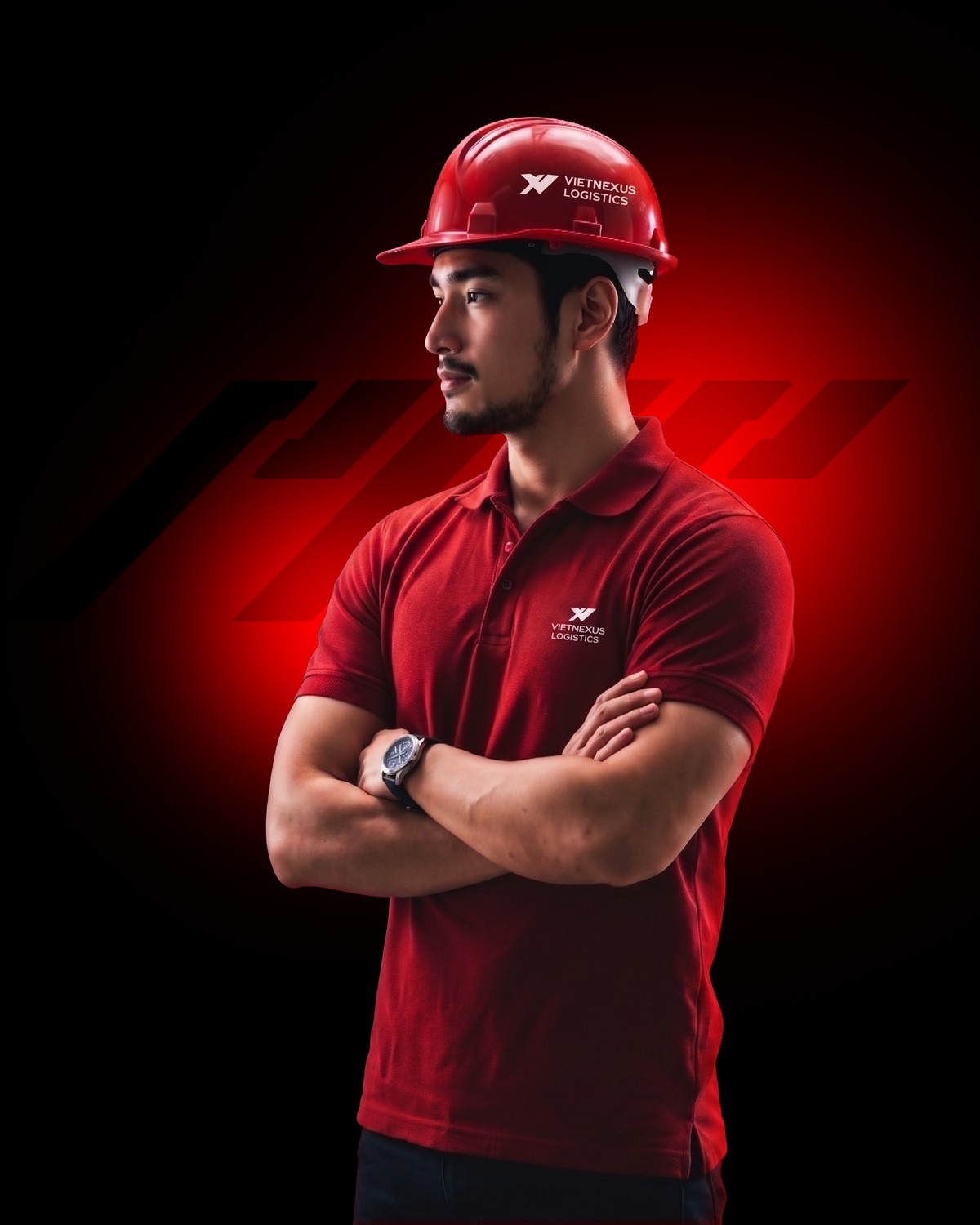
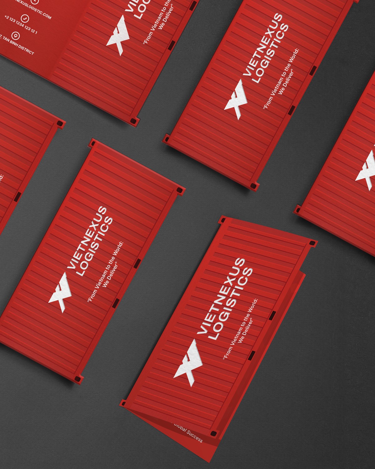
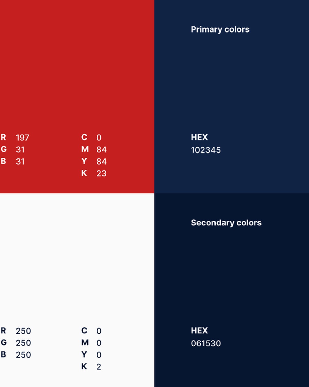
From the corner-casting geometry of shipping containers to a unified V + N + W mark, the system was built outward: logo, color, typography, stationery and signage, each piece reinforcing Vietnexus as a bridge between Vietnam and the world.

(04) Showcase
Brand Identity
Final Design